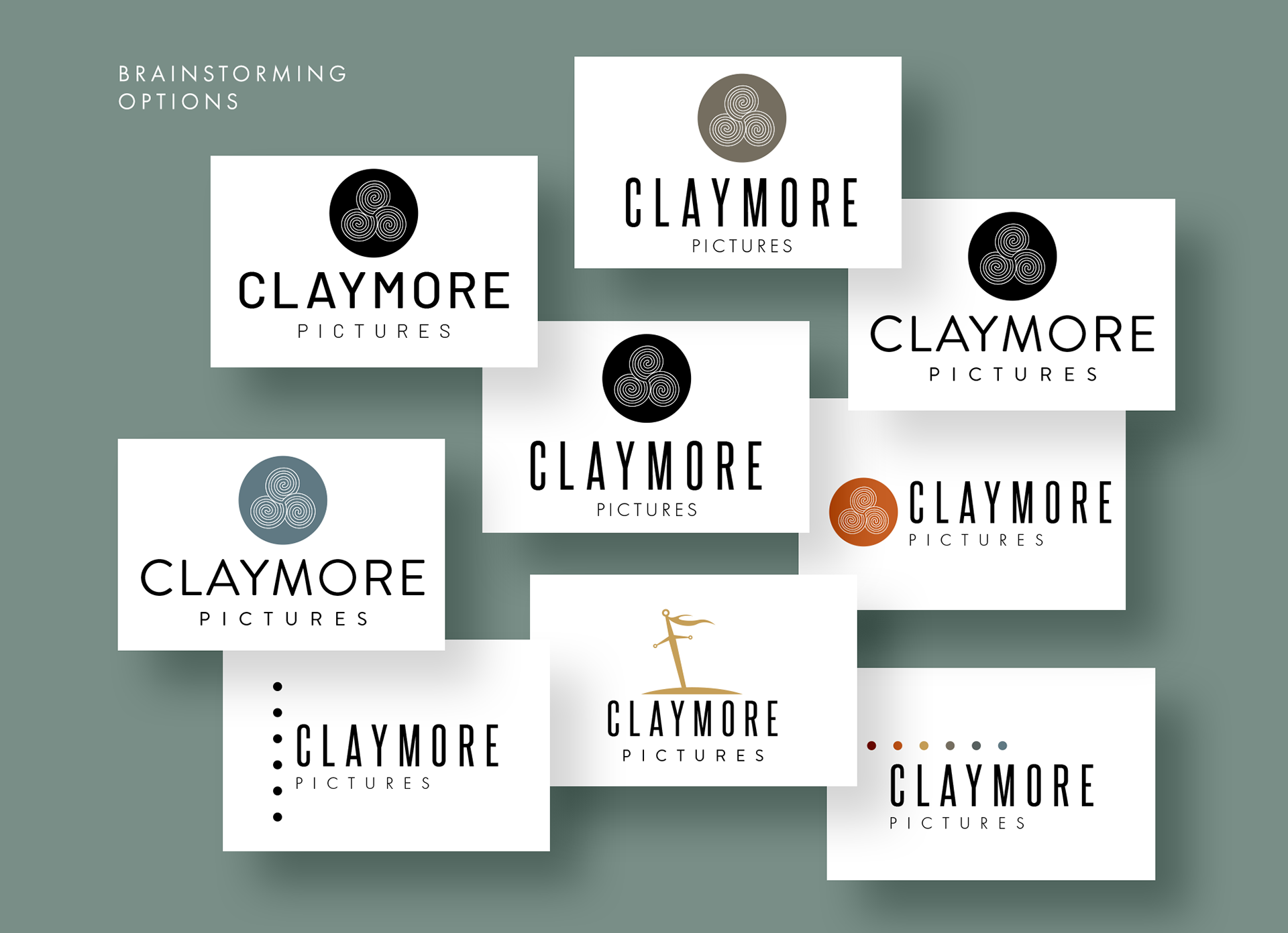
When my friend and colleague Peter-John Campbell asked me to throw together some ideas for a logo rebranding project for his company I was met with some serious "design-block". Having seen his logo for many years now the thought of coming up with something different placed me in a biased state in which no other option seemed professional enough. In order to come up with options that met both his minimalist preferences and his desire to include a symbol in the logo mark, I had to dig deeper than usual.
The options presented included a version that utilized a variation of the spiral of life symbol as its visual mark. Another option include a crude illustration that seemed a little too on the nose as an option. The final option included an ancient Bronze age symbol which was used when "information was missing, and it should be filled with imagination or memory." Considering Peter-John's story telling emphasis, especially in the midst of a rebranding, it only seemed appropriate to utilize a symbol such as this.
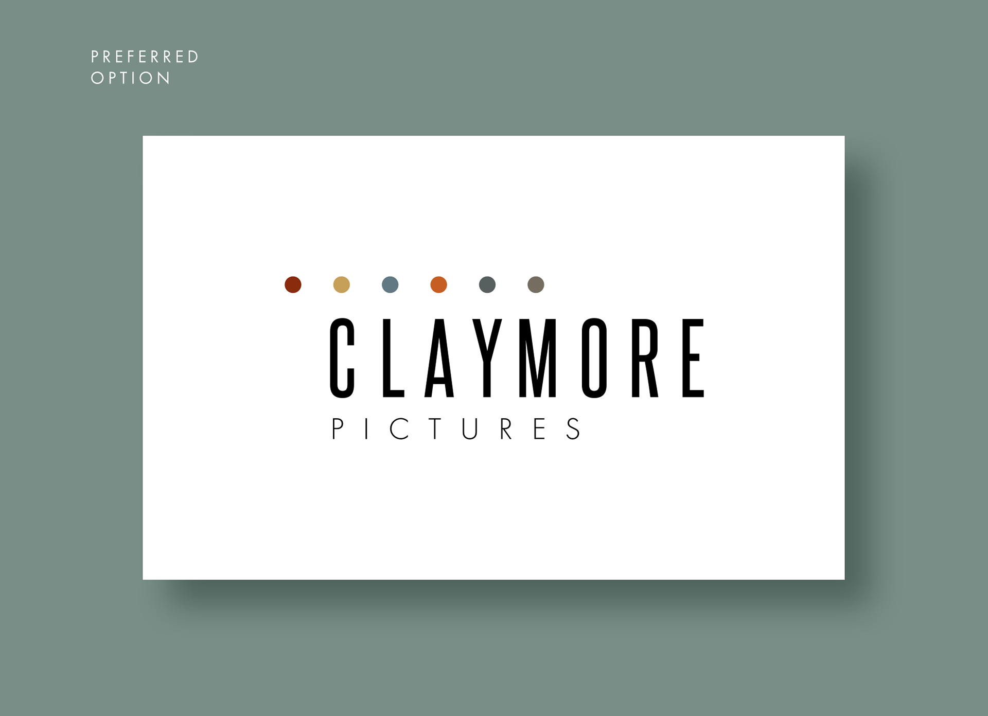
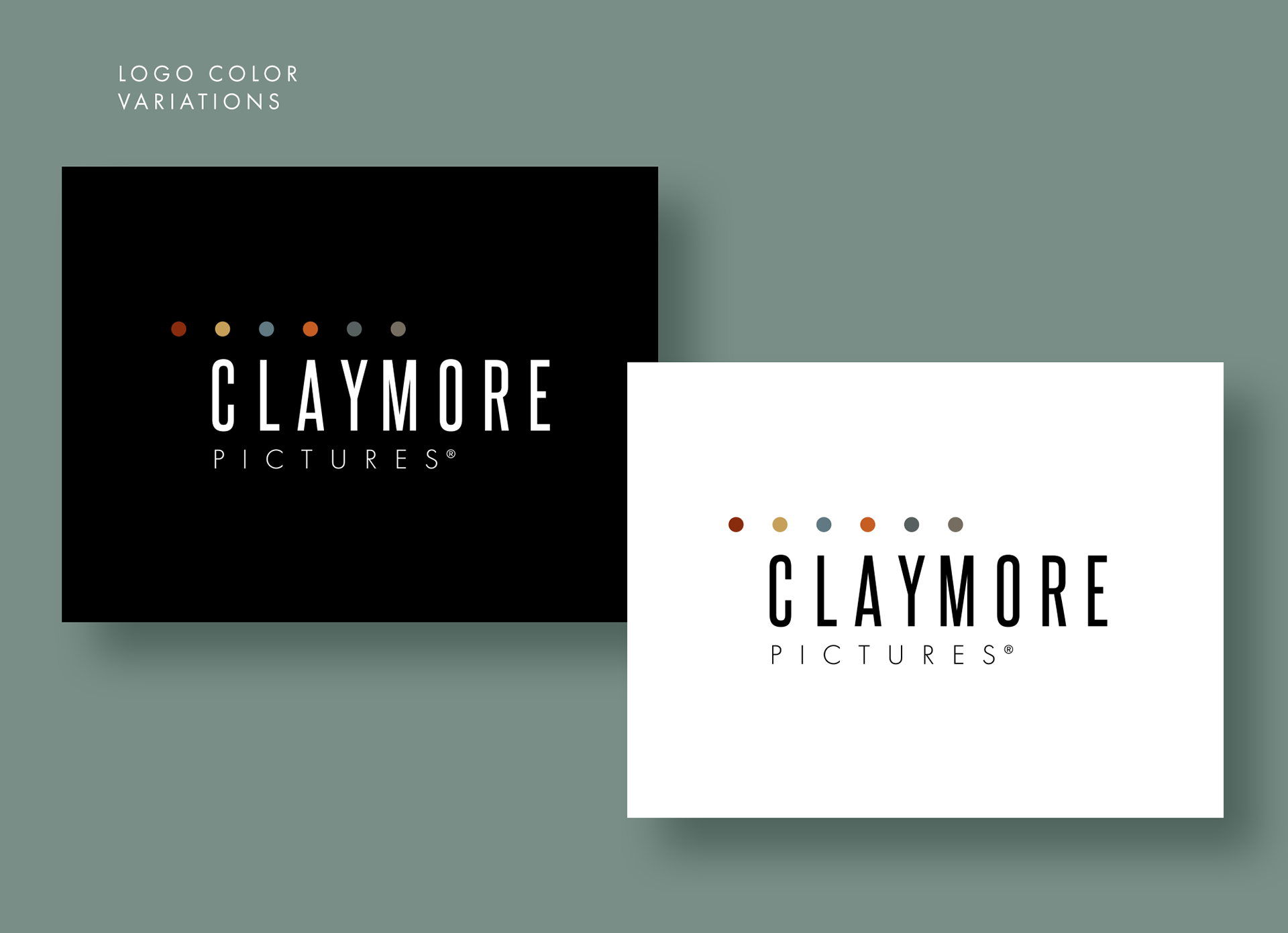
The visuals are simple enough to meet the minimalist requirement, while also allowing themselves to be manipulated in future applications with almost endless possibilities. The color palette was influenced heavily by films of the 90's and current films drawing heavily from that aesthetic. The font, Steelfish Regular, was modified slightly to ensure that the kerning between the characters allowed them to align with the set of equality distributed "dots" in the symbol.
As a system, this logo mark allows for future manipulation and a broad application usage.